Logo design process
Our logo was designed by Anum Usman. She is founder/graphic designer of Dirac-Delta Inc, based in Edmonton, Canada. This write-up, as a dialogue between Anum and Rajesh, shows the iterative process for the logo design.
Organizational values
Rajesh: I was looking for a logo to emphasize the motto of 'prioritizing human ethics over technology to address climate change'. At the same time it would be good for the logo to have elements from the fungal world (mycelium network or the mushrooms, fruiting body of the fungi) to symbolically reflect its role in providing solutions to humans for climate change (For example soil accounts for 75 percent of all terrestrial carbon and much of this accumulated carbon is originated from the root associated fungal network inside the soil). The representation of fungi also conveys the interdisciplinary focus of this platform.
Challenge
Anum: The biggest challenge was incorporating somewhat abstract concept of the company's motto into the logo in a way that would be easily recognizable by people. Rajesh wanted a logo that was unique and did not use many of the elements that a lot of modern logos are using so it could stand out.
Design iterations
Anum: We explored many concepts of the logo in our iteration as presented below:
- Mycelium network that became part of the name Anabe Labs, along with a leaf to incorporate nature/climate.

- Logo with liberty cap fungi and a mycelium background behind it

- Combination of mycelium and turkey tail fungi, where they blended into each other to show interdisciplinary approach.

- Mycelium, a hand and a gear in a circle to show the interdisciplinary nature of technology, climate resilience and nature.

The colors for the above versions were based on an earthy palette that best described the company's approach towards climate and nature.
Rajesh: The above versions captured the fungal representation, but the motto of the company was not embedded in a self-evident manner. To rectify, Anum went back to the drawing board to adopt a layered approach to highlight the motto. The layer of technology in the form of a semiconductor chip was overlapped with a behavioral layer (human face) to show the intersection of these two values, as seen below:

The fungal element was reintroduced into the logo on the behavioral layer with 3 variants as seen in the subsequent iterations:


The third variant in the above iteration was chosen with change in the mushroom location and colors were finalized.
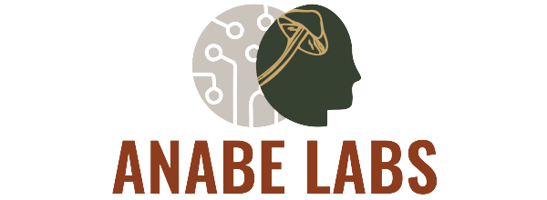
The final Logo

Anum: Technology is shown by the greyed-out semiconductor chip behind the human head which represents the emphasis on behavioral change. The mushroom is placed where the brain is, as it's an integral part of the company name.
The colors chosen are very earthy, yet bold. Dark forest green gives a sense of earthiness and a climate friendly approach. Burgundy brings a sense of warmth and boldness to the logo.
The font is Oswald in SemiBold variation. Sans serif font type shows efficiency and modernity. The SemiBold version makes the company look modern and approachable.
